- Home
- Resources
- Work samples
- Samples
- Magazine cover - AT
The Arts: Media Arts
Years 7 and 8
Satisfactory
Magazine cover
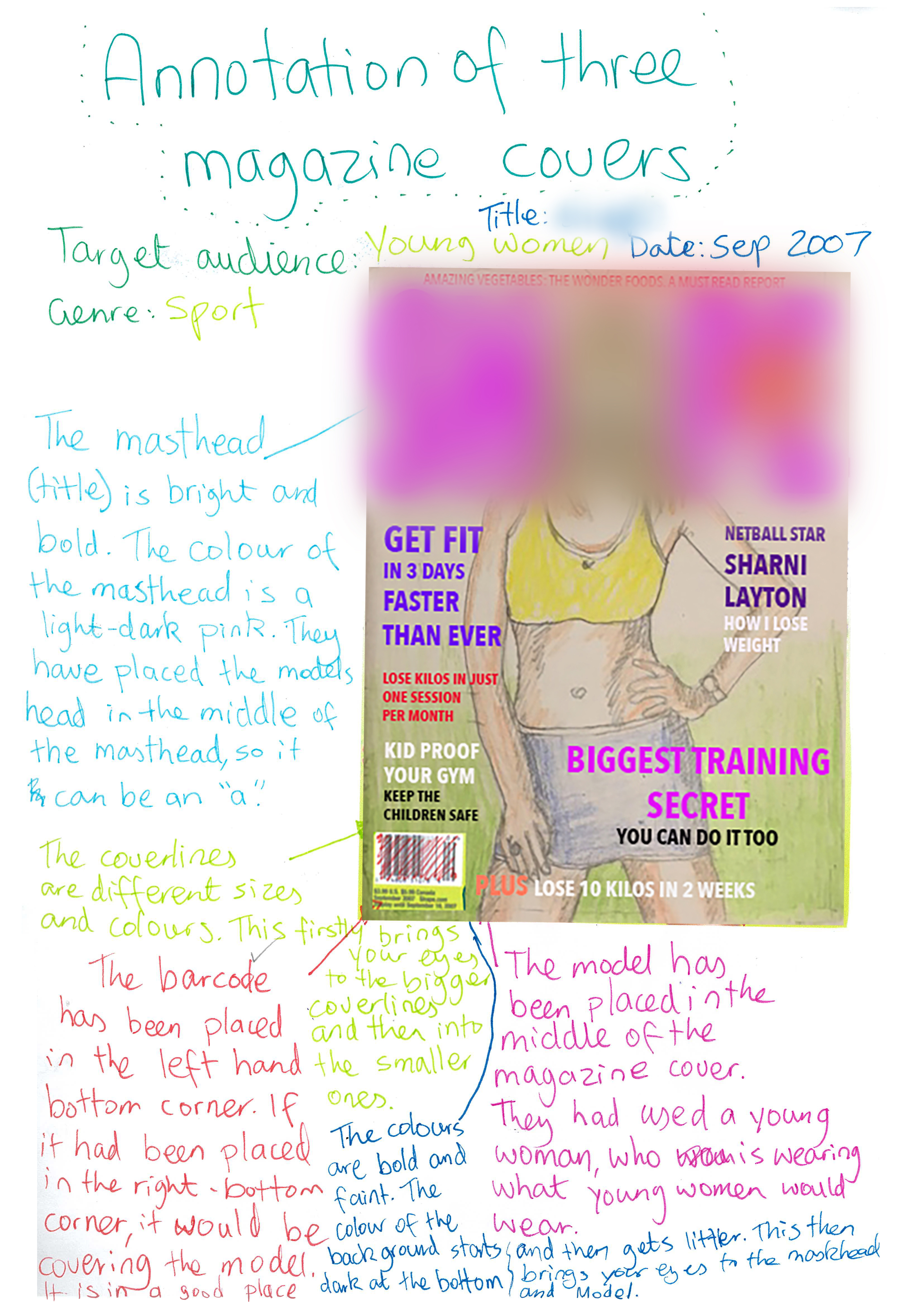 1
Annotation 1
Identifies how colour and layout are used to make the masthead more engaging 2 Annotation 2
Identifies how colour and layout are used to make the masthead more engaging 3 Annotation 3
Identifies reasons for choices in layout 4 Annotation 4
Identifies the use of shading colour to engage an audience
-
Annotations
-
1
Annotation 1
Identifies how colour and layout are used to make the masthead more engaging -
2
Annotation 2
Identifies how colour and layout are used to make the masthead more engaging -
3
Annotation 3
Identifies reasons for choices in layout -
4
Annotation 4
Identifies the use of shading colour to engage an audience
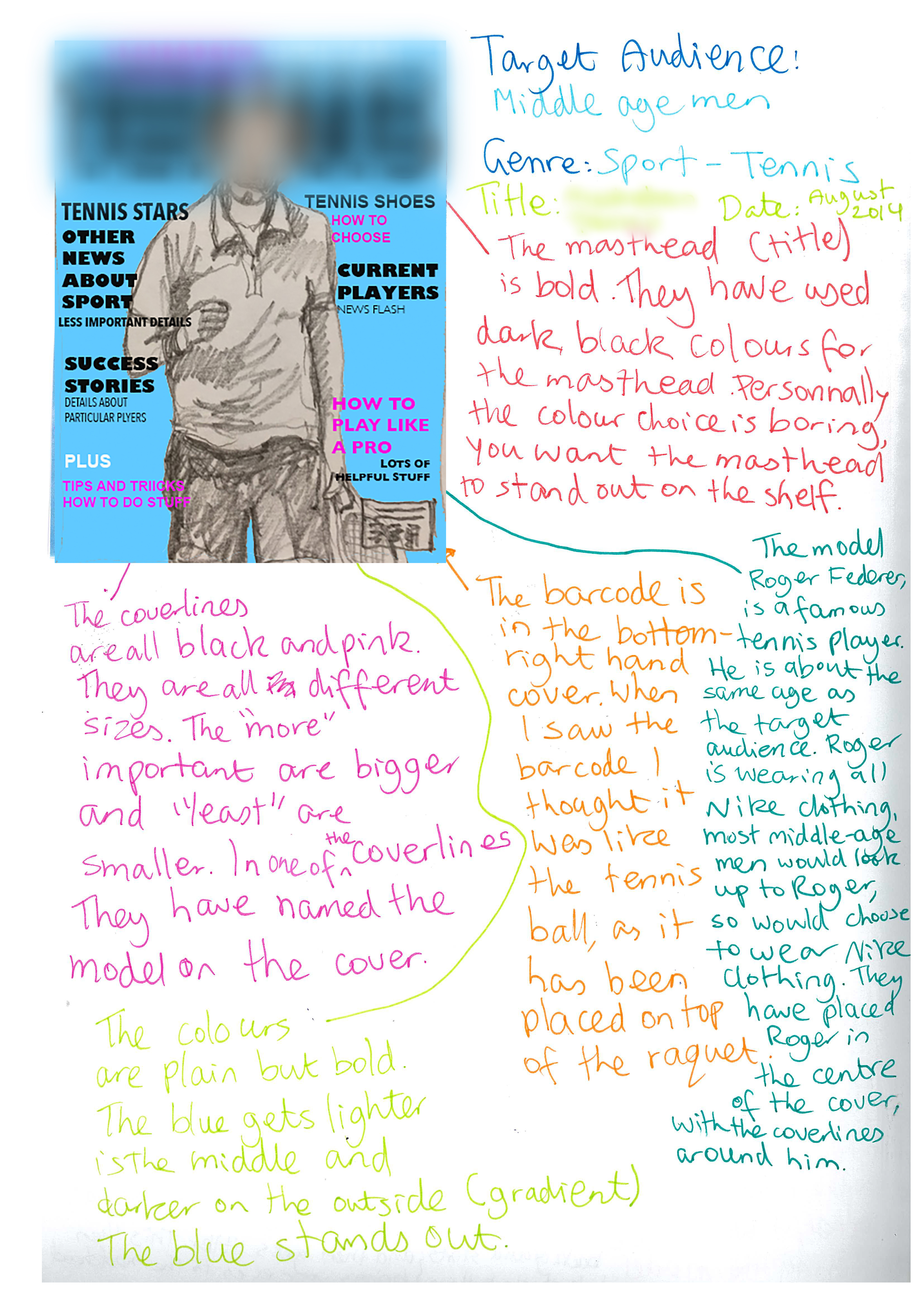 1
Annotation 1
Identifies the target audience of the magazine 2 Annotation 2
Identifies the magazine’s genre 3 Annotation 3
Analyses the effect of colour choice in the masthead 4 Annotation 4
Identifies the use of the model to engage the magazine’s target audience
-
Annotations
-
1
Annotation 1
Identifies the target audience of the magazine -
2
Annotation 2
Identifies the magazine’s genre -
3
Annotation 3
Analyses the effect of colour choice in the masthead -
4
Annotation 4
Identifies the use of the model to engage the magazine’s target audience
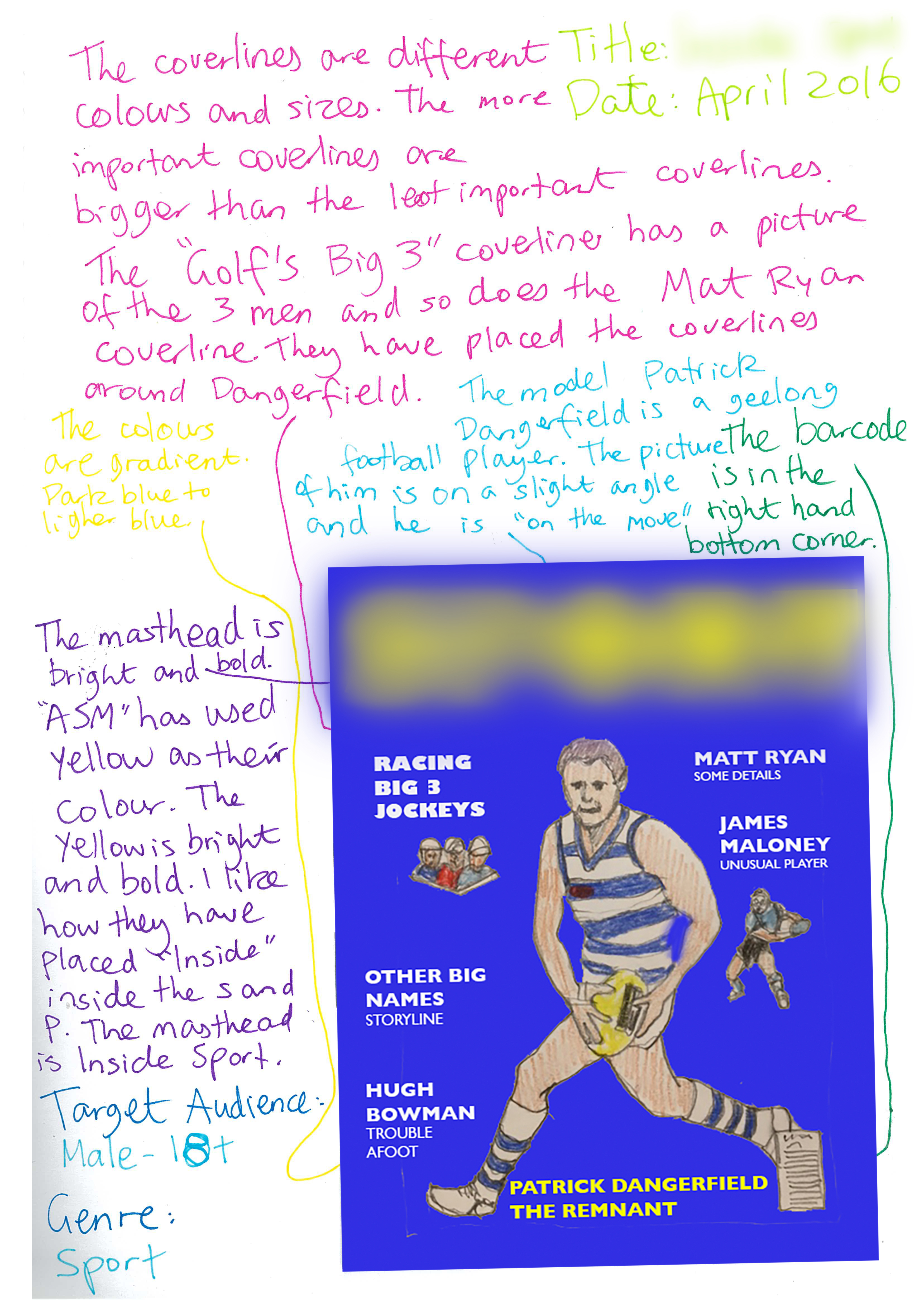 1
Annotation 1
Identifies how font, colour and its shading are used to engage an audience
-
Annotations
-
1
Annotation 1
Identifies how font, colour and its shading are used to engage an audience
 1
Annotation 1
Completes a magazine cover and identifies its technical and symbolic elements, as well as conventions 2 Annotation 2
Analyses the masthead and its effectiveness 3 Annotation 3
Analyses the use of colour and layout in the cover lines 4 Annotation 4
Discusses the choice of the model and links her to the target audience 5 Annotation 5
Discusses the choice of images and their manipulation in desktop publishing
-
Annotations
-
1
Annotation 1
Completes a magazine cover and identifies its technical and symbolic elements, as well as conventions -
2
Annotation 2
Analyses the masthead and its effectiveness -
3
Annotation 3
Analyses the use of colour and layout in the cover lines -
4
Annotation 4
Discusses the choice of the model and links her to the target audience -
5
Annotation 5
Discusses the choice of images and their manipulation in desktop publishing
Above satisfactory
Magazine cover
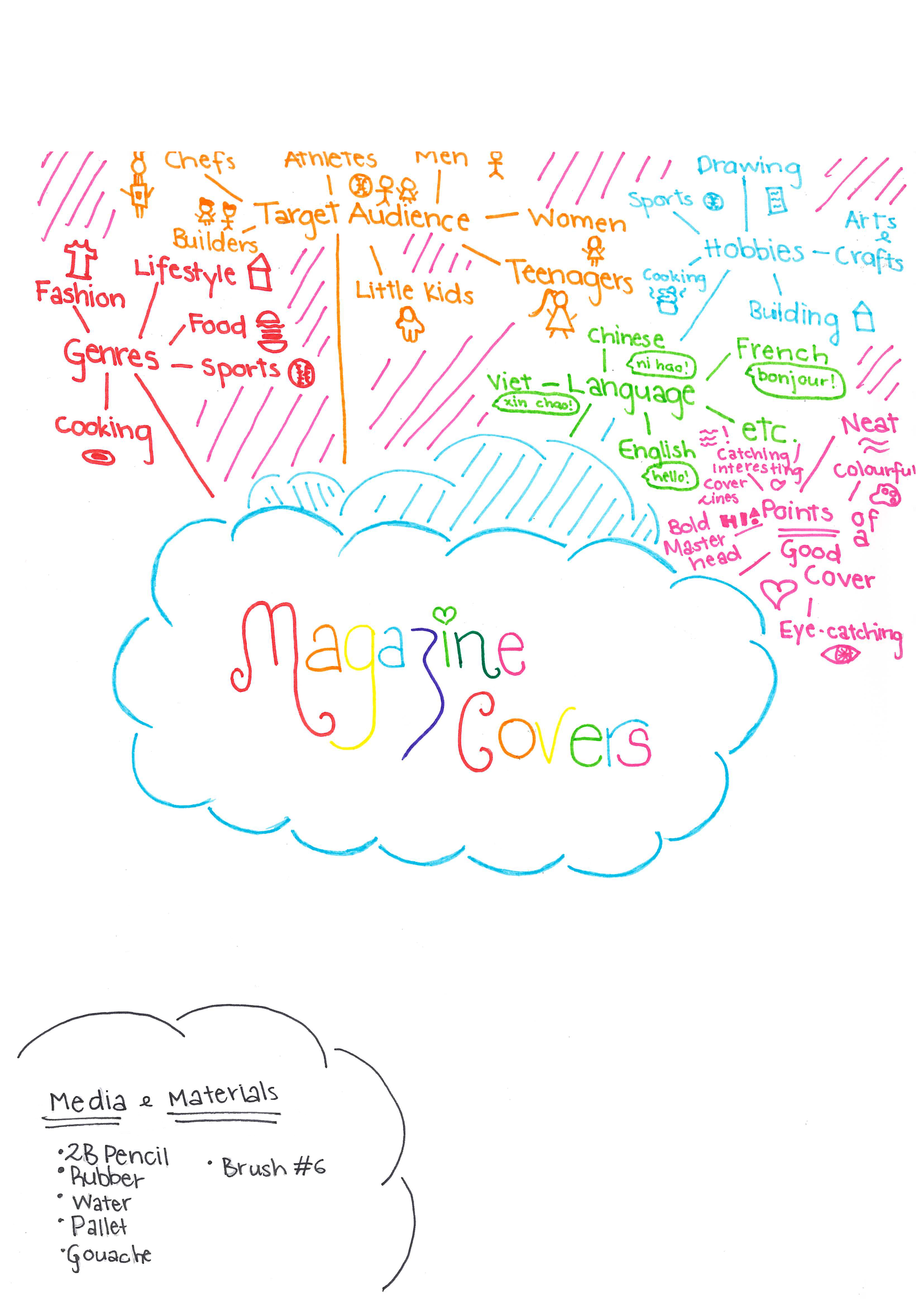 1
Annotation 1
Identifies a range of conventions and techniques used in magazine covers 2 Annotation 2
Identifies materials to make a magazine cover
-
Annotations
-
1
Annotation 1
Identifies a range of conventions and techniques used in magazine covers -
2
Annotation 2
Identifies materials to make a magazine cover
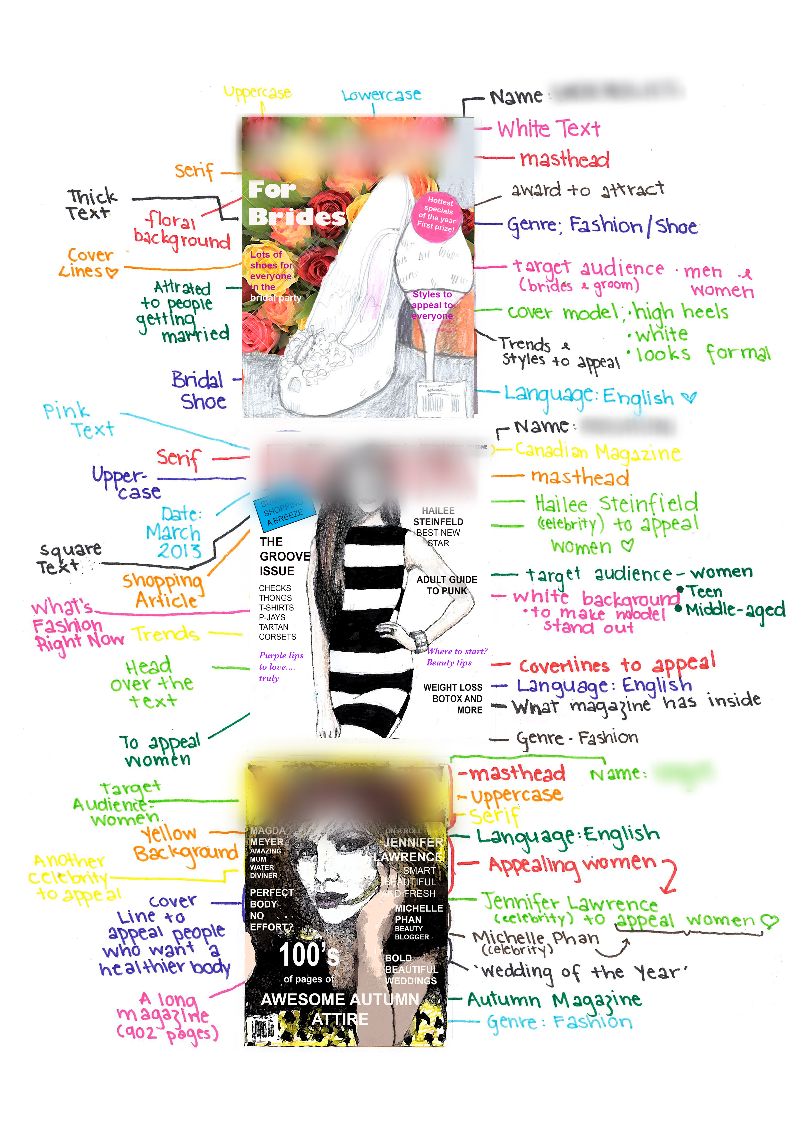 1
Annotation 1
Identifies use of font style, upper and lower case 2 Annotation 2
Identifies the genre of the magazine 3 Annotation 3
Identifies engaging symbolic elements of the layout 4 Annotation 4
Describes the specific audience for the edition of the magazine 5 Annotation 5
Identifies the convention of a magazine masthead 6 Annotation 6
Identifies the convention of coverlines and states their purpose 7 Annotation 7
Notes engaging choices in layout 8 Annotation 8
Identifies the use of colour to engage an audience 9 Annotation 9
Lists elements that target the magazine's female audience
-
Annotations
-
1
Annotation 1
Identifies use of font style, upper and lower case -
2
Annotation 2
Identifies the genre of the magazine -
3
Annotation 3
Identifies engaging symbolic elements of the layout -
4
Annotation 4
Describes the specific audience for the edition of the magazine -
5
Annotation 5
Identifies the convention of a magazine masthead -
6
Annotation 6
Identifies the convention of coverlines and states their purpose -
7
Annotation 7
Notes engaging choices in layout -
8
Annotation 8
Identifies the use of colour to engage an audience -
9
Annotation 9
Lists elements that target the magazine's female audience
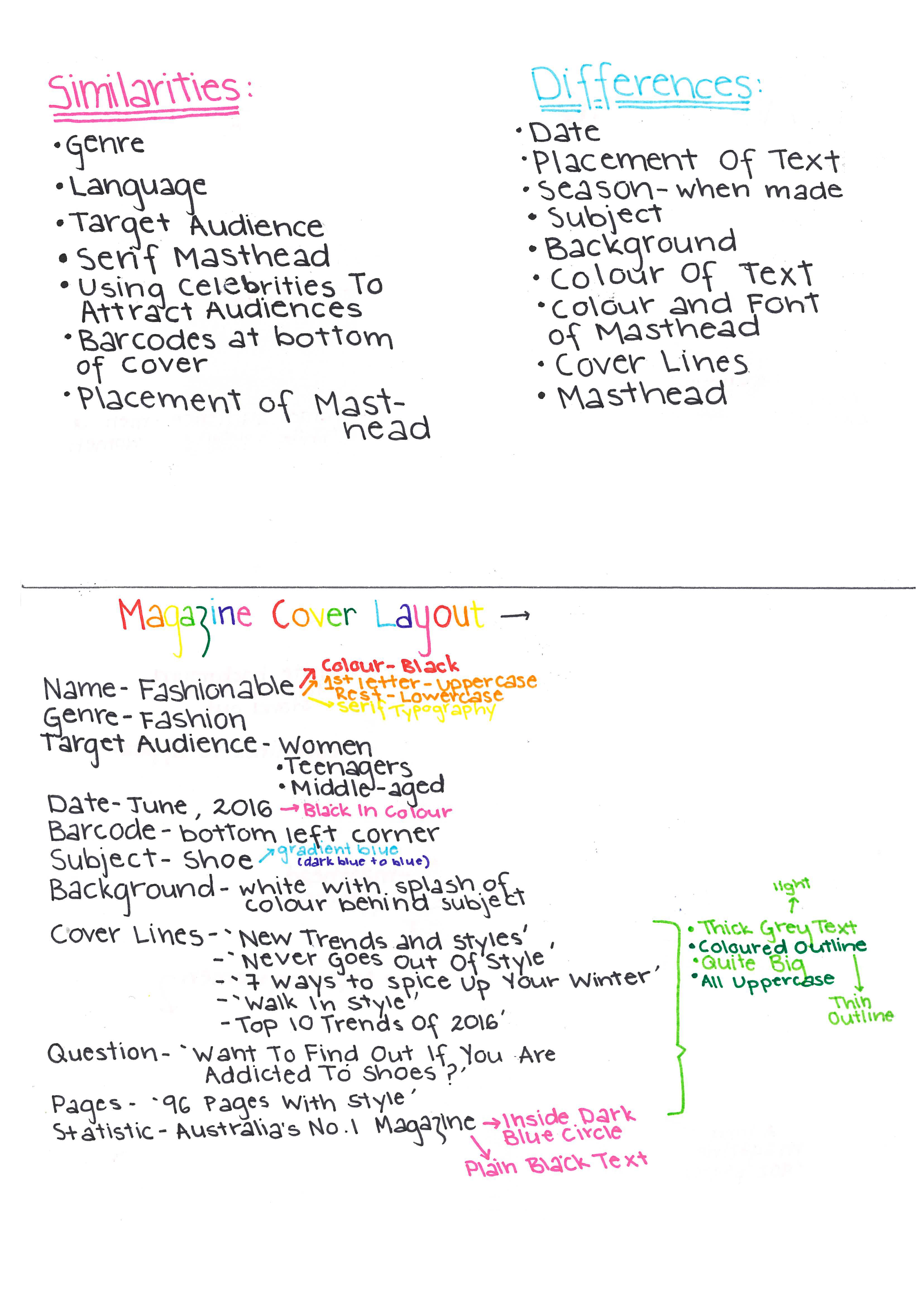 1
Annotation 1
Lists similarities and differences in the use of conventions and techniques in magazine covers 2 Annotation 2
Plans a magazine cover using conventions and technical and symbolic elements
-
Annotations
-
1
Annotation 1
Lists similarities and differences in the use of conventions and techniques in magazine covers -
2
Annotation 2
Plans a magazine cover using conventions and technical and symbolic elements
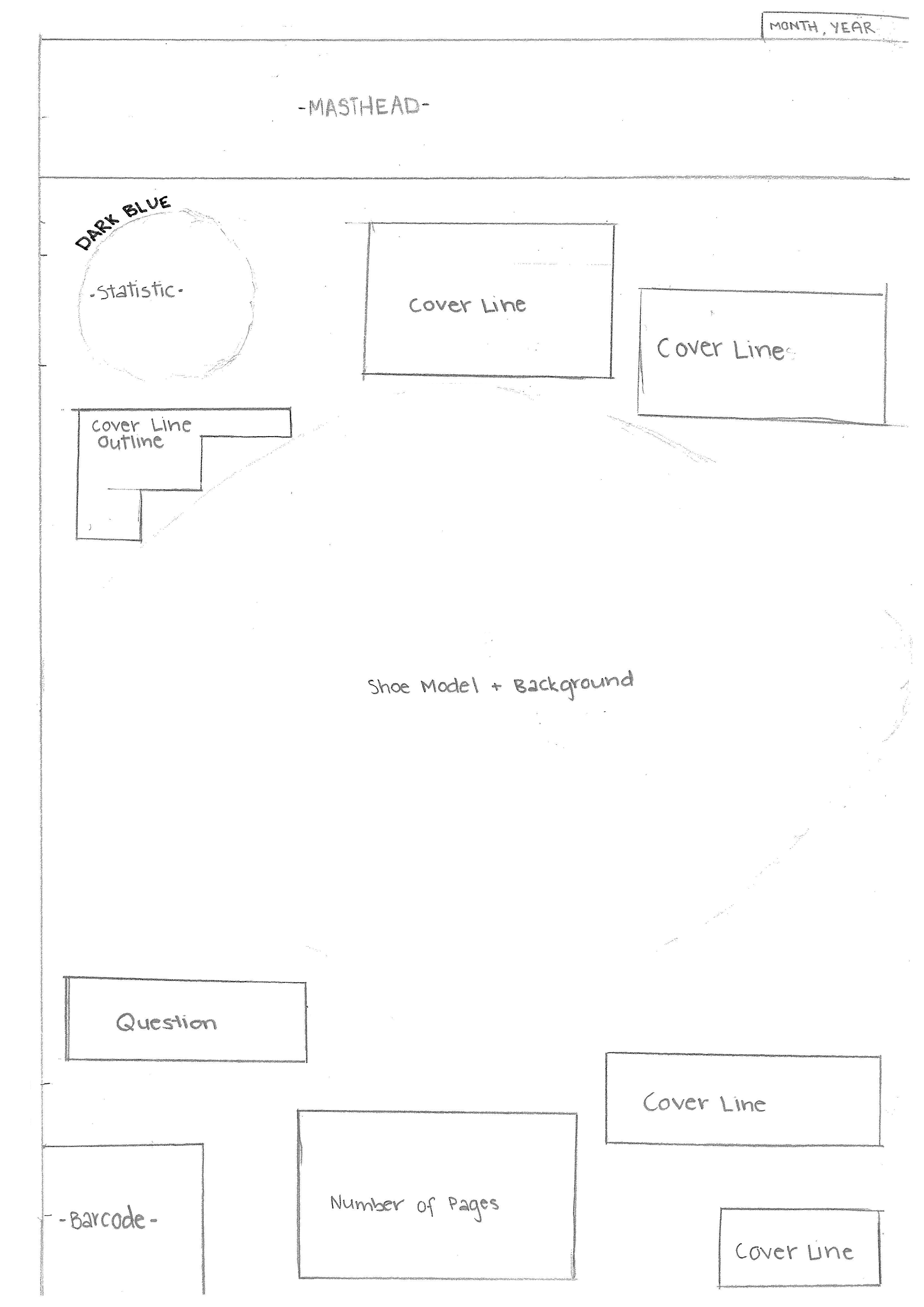 1
Annotation 1
Plans the layout of a magazine cover
-
Annotations
-
1
Annotation 1
Plans the layout of a magazine cover
 1
Annotation 1
Completes a rough copy of a magazine cover and identifies refinements in technical elements 2 Annotation 2
Identifies where adjustments can be made to improve the magazine cover using desktop publishing software
-
Annotations
-
1
Annotation 1
Completes a rough copy of a magazine cover and identifies refinements in technical elements -
2
Annotation 2
Identifies where adjustments can be made to improve the magazine cover using desktop publishing software
 1
Annotation 1
Chooses engaging phrases and sensory words in the cover lines to engage an audience 2 Annotation 2
Completes a magazine cover that employs technical and symbolic elements to make meaning with clarity 3 Annotation 3
Chooses an engaging colour palette 4 Annotation 4
Demonstrates a detailed understanding of the conventions of magazine covers
-
Annotations
-
1
Annotation 1
Chooses engaging phrases and sensory words in the cover lines to engage an audience -
2
Annotation 2
Completes a magazine cover that employs technical and symbolic elements to make meaning with clarity -
3
Annotation 3
Chooses an engaging colour palette -
4
Annotation 4
Demonstrates a detailed understanding of the conventions of magazine covers
Below satisfactory
Magazine cover
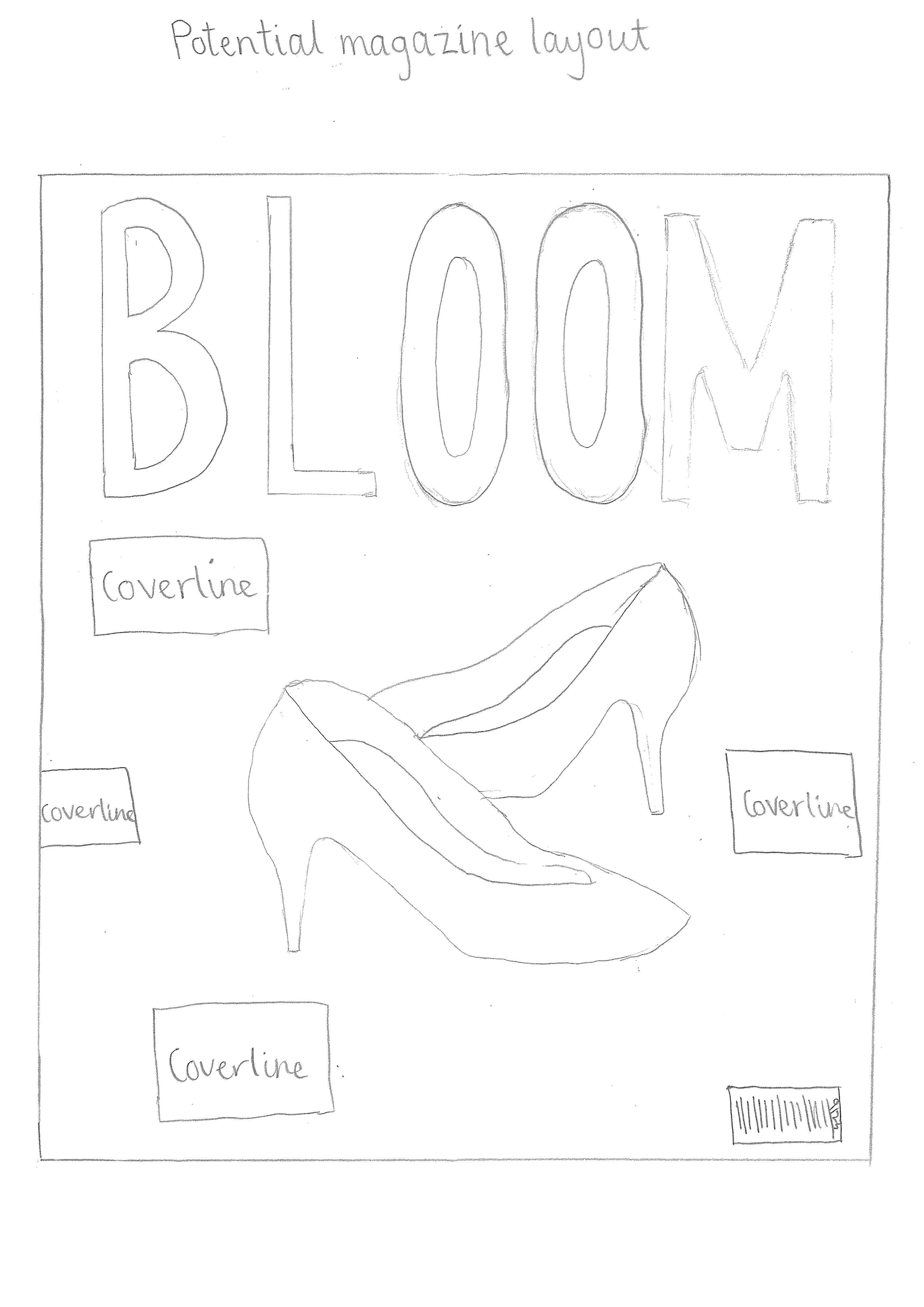 1
Annotation 1
Plans the layout of a magazine cover 2 Annotation 2
Identifies cover lines as a technical element in a magazine cover 3 Annotation 3
Plans a barcode to convention
-
Annotations
-
1
Annotation 1
Plans the layout of a magazine cover -
2
Annotation 2
Identifies cover lines as a technical element in a magazine cover -
3
Annotation 3
Plans a barcode to convention
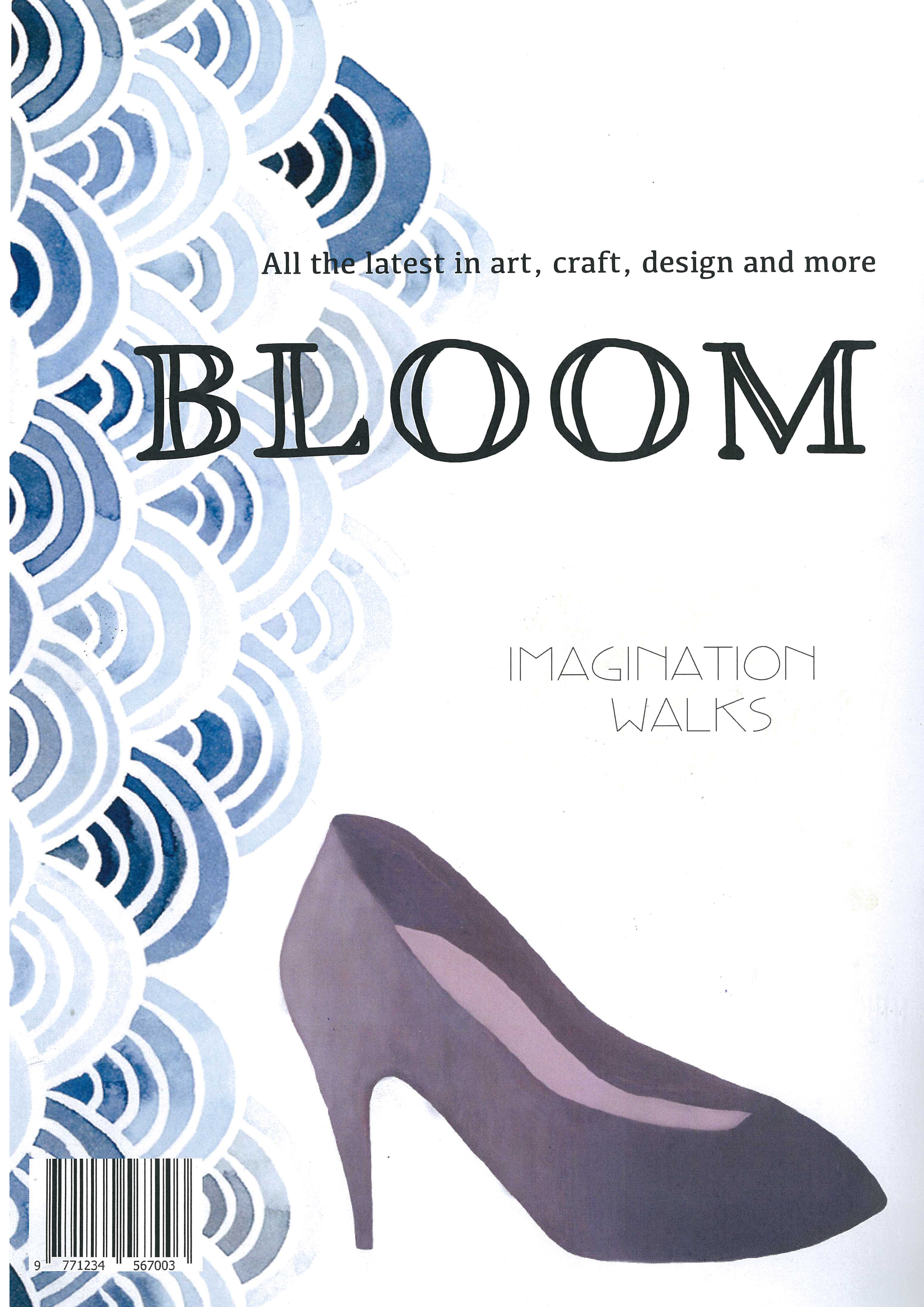 1
Annotation 1
Completes a magazine cover using desktop publishing software 2 Annotation 2
Uses a masthead for the magazine 3 Annotation 3
Uses image and colour to engage an audience
-
Annotations
-
1
Annotation 1
Completes a magazine cover using desktop publishing software -
2
Annotation 2
Uses a masthead for the magazine -
3
Annotation 3
Uses image and colour to engage an audience
Satisfactory
Magazine cover
 1
Annotation 1
Identifies how colour and layout are used to make the masthead more engaging 2 Annotation 2
Identifies how colour and layout are used to make the masthead more engaging 3 Annotation 3
Identifies reasons for choices in layout 4 Annotation 4
Identifies the use of shading colour to engage an audience
-
Annotations
-
1
Annotation 1
Identifies how colour and layout are used to make the masthead more engaging -
2
Annotation 2
Identifies how colour and layout are used to make the masthead more engaging -
3
Annotation 3
Identifies reasons for choices in layout -
4
Annotation 4
Identifies the use of shading colour to engage an audience
 1
Annotation 1
Identifies the target audience of the magazine 2 Annotation 2
Identifies the magazine’s genre 3 Annotation 3
Analyses the effect of colour choice in the masthead 4 Annotation 4
Identifies the use of the model to engage the magazine’s target audience
-
Annotations
-
1
Annotation 1
Identifies the target audience of the magazine -
2
Annotation 2
Identifies the magazine’s genre -
3
Annotation 3
Analyses the effect of colour choice in the masthead -
4
Annotation 4
Identifies the use of the model to engage the magazine’s target audience
 1
Annotation 1
Identifies how font, colour and its shading are used to engage an audience
-
Annotations
-
1
Annotation 1
Identifies how font, colour and its shading are used to engage an audience
 1
Annotation 1
Completes a magazine cover and identifies its technical and symbolic elements, as well as conventions 2 Annotation 2
Analyses the masthead and its effectiveness 3 Annotation 3
Analyses the use of colour and layout in the cover lines 4 Annotation 4
Discusses the choice of the model and links her to the target audience 5 Annotation 5
Discusses the choice of images and their manipulation in desktop publishing
-
Annotations
-
1
Annotation 1
Completes a magazine cover and identifies its technical and symbolic elements, as well as conventions -
2
Annotation 2
Analyses the masthead and its effectiveness -
3
Annotation 3
Analyses the use of colour and layout in the cover lines -
4
Annotation 4
Discusses the choice of the model and links her to the target audience -
5
Annotation 5
Discusses the choice of images and their manipulation in desktop publishing